Re-branding for Belliza Institute
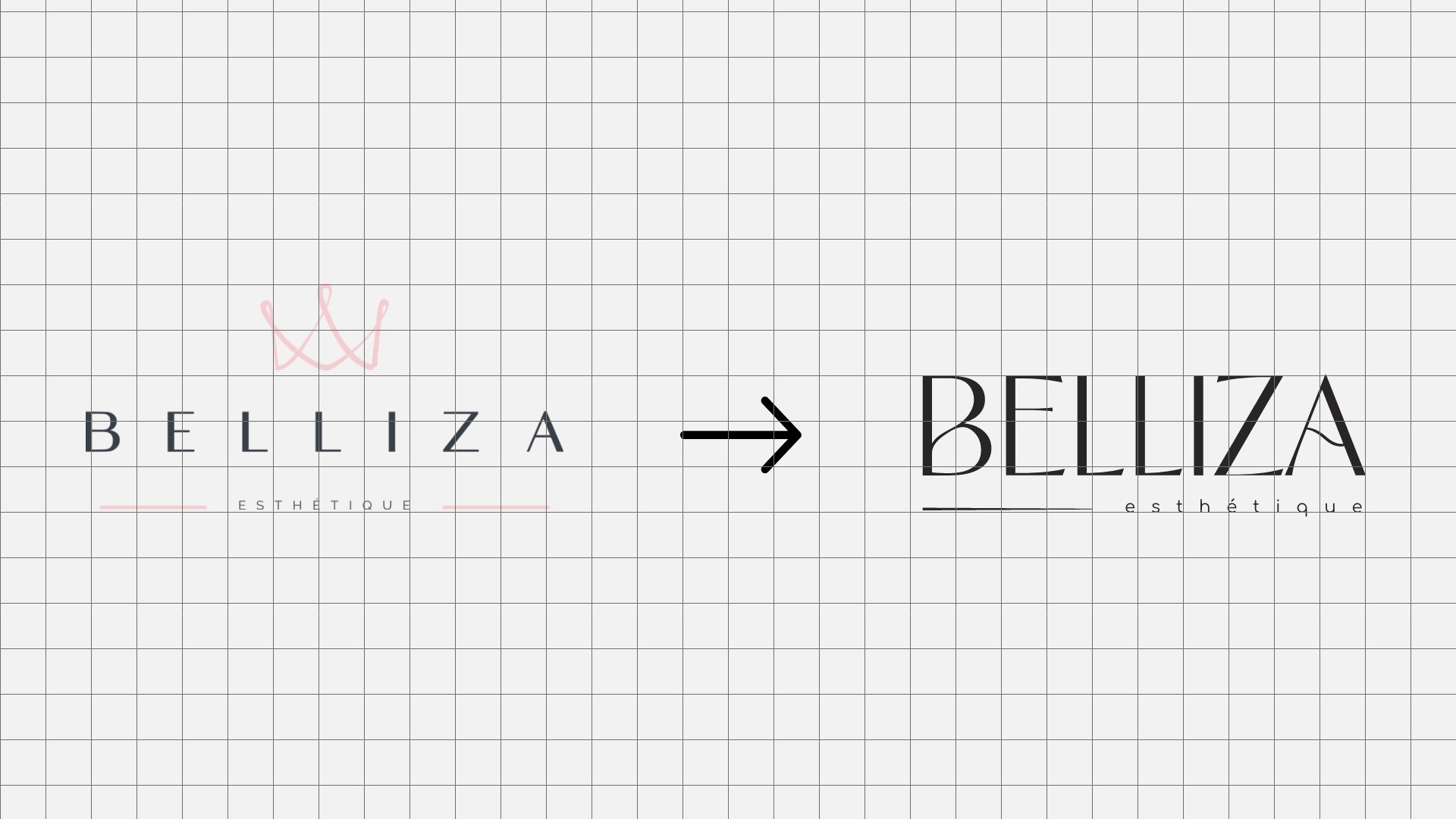
The project revolved around redefining the brand identity for Belliza, a medical aesthetic institute that had evolved beyond its initial girly branding. As the brand transitioned to embrace a more mature poise-oriented focus, it became evident that the existing brand identity and logo no longer resonated. The goal was to craft a new logo that captured the essence of pampering, beauty and rejuvenation coincident with the mission.
The design solution centered on incorporating elements reminiscent of waves, symbolizing tranquility and fluidity. Notably, the curves in the letters 'B' and 'A' were meticulously crafted to emulate the gentle flow of water, infusing the logo with a sense of serenity while maintaining a sleek and modern aesthetic. This strategic redesign aimed to realign the brand's visual identity with its evolving ethos, reinforcing Belliza's commitment to providing a revitalizing space for its clientele.
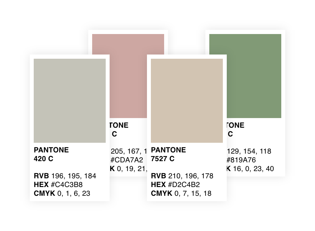
Here’s a quick visual overview of the contents of Belliza's Brand Book :


